


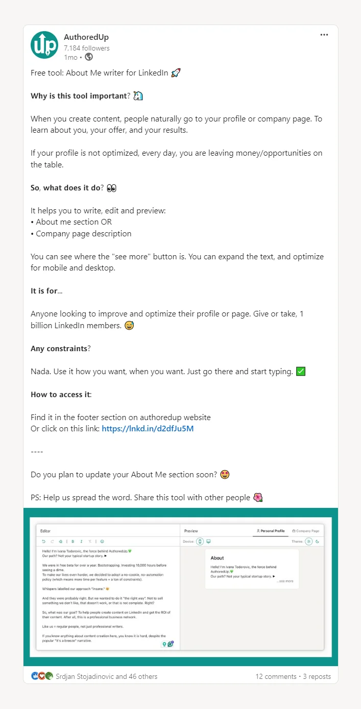
Have you ever noticed those LinkedIn posts that just seem to stand out because of their impeccable formatting?
Yes, those are the ones that effectively use bullet points, numbered lists, emojis, and just the right touch of modern styling.
Today, we’ll teach you how to craft such LinkedIn posts on your own.
In this article, we'll explore the different styles of bullet points you can use on LinkedIn.
Plus, we’ll also share essential do’s and don'ts for utilizing them in your posts.
Let's dive into these techniques!
Navigating the Challenges of Formatting LinkedIn Posts
Effective formatting plays a crucial role in how your LinkedIn content is perceived, influencing both the tone of your message and its overall impact.
Well-formatted posts are more likely to:
- catch the eye,
- get more likes, and
- increase the engagement.
As part of your marketing strategy, your aim is to improve your posts with these formatting elements.
But sometimes, bullet points just don't work as expected.
Let's reflect on the most common formatting problem on LinkedIn:
👉 Remember those times when you write a post with the perfect setup, only to find that the formatting doesn't appear correctly once published?
This frustrating issue often stems from LinkedIn's platform limitations.
Unlike some other social media platforms, LinkedIn does not natively support certain formatting features like bullets, numbers, and emojis in the way content creators might hope.
Despite these challenges, there are still strategies you can employ to overcome these limitations and enhance your post's format.
Understanding the platform's coding constraints is the first step to finding workarounds that allow you to deliver your content as intended, ensuring it stands out effectively in your audience's feed.
💡Pro Tip
Formatting problems aren’t just annoying, they cost you attention.
If your bullet points collapse or emojis misalign, your post instantly becomes harder to scan. That means less engagement and a wasted opportunity to deliver your message clearly.
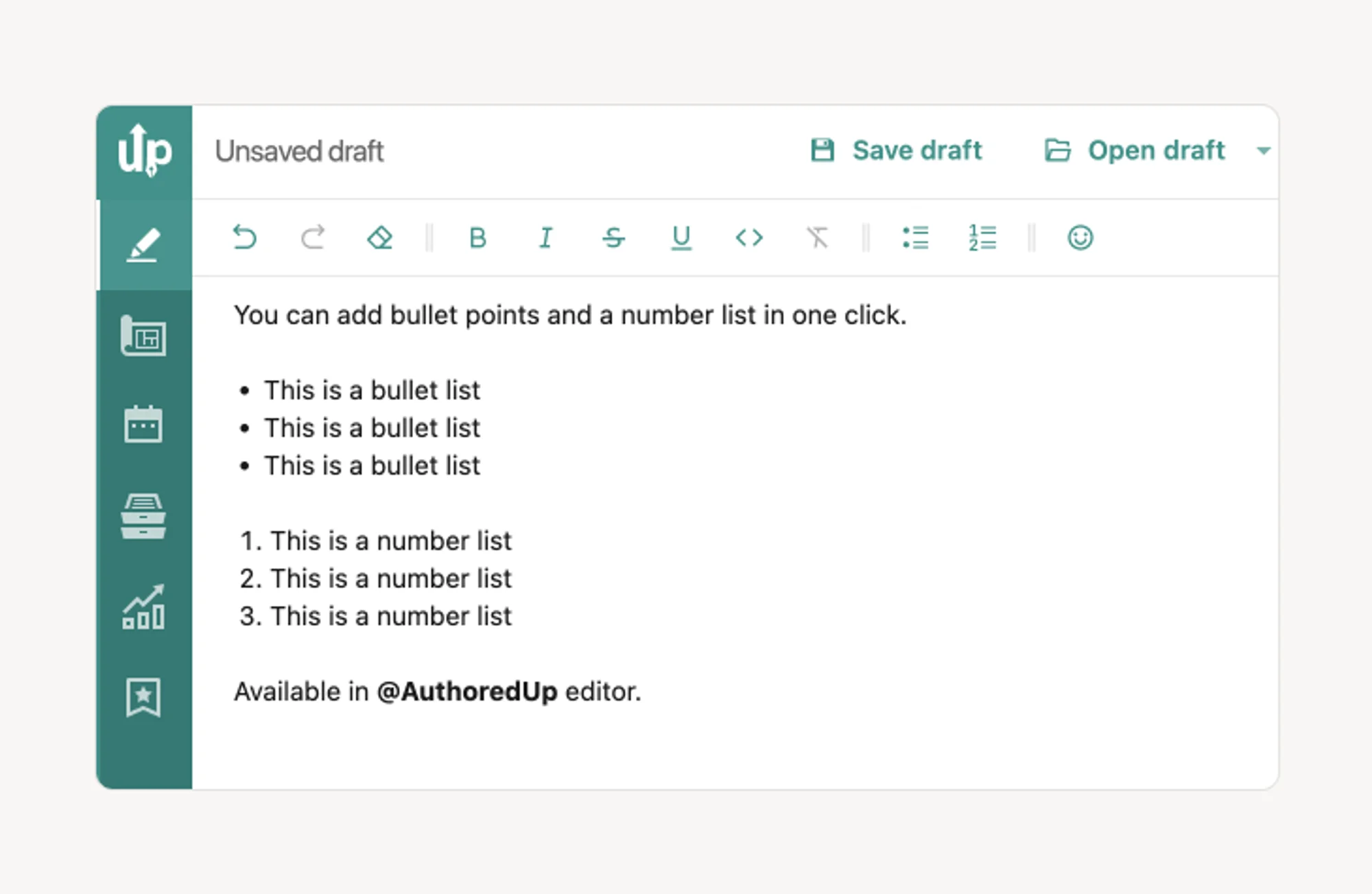
The free LinkedIn Text Formatter simplifies this process, allowing you to incorporate various bullet styles (such as check marks, numbered lists, etc) directly into your content.
With just a few clicks, you can transform standard text into well-structured lists that capture attention and convey information effectively.
No hacks. No guesswork. Just clean formatting that makes your posts readable and saves you time.

Exploring Different Bullet Points Options for Your LinkedIn Posts
1. Check Marks/Checkboxes
Check marks serve as excellent bullet points for LinkedIn posts, particularly for listing achievements, summarizing product features, or updating on project milestones.
Wisdom Bits
- Use green check marks ✅ to indicate resolutions or accomplishments, adding a positive visual cue.
- Employ red X-marks ❌ to highlight problems or bad practices, providing a clear visual contrast.
- Combine check marks and X-marks to effectively demonstrate solutions alongside issues, enhancing the persuasive power of your post.
Effectiveness of Check Marks/Checkboxes
Using check marks and X-marks allows you to present contrasting ideas in a clear and memorable "good vs bad" format, making your content more engaging and easier for your audience to remember.
2. Number Lists in LinkedIn Posts
Number lists are ideal for structuring longer or step-by-step content on LinkedIn, where regular bullets might cause the details to blend together and obscure the message.
Wisdom Bits
- Utilize efficient numbering to guide the natural flow of content and maintain reader focus from one point to the next.
- Enhance readability and appeal by setting numbers within square frames, creating a distinct separation between points.
- Limit lists to a few key points (such as three) to align with familiar formats that are easy for the mind to follow and remember.
Effectiveness of Number Lists
Number lists effectively organize information into a clear, logical progression, making the content easier to follow and more engaging.
They are particularly useful for sharing step-by-step instructions or detailed lists, ensuring each point stands out and is understood by the audience.
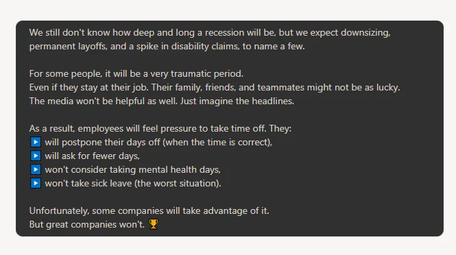
3. Squares and Triangles as Bullets in LinkedIn Posts
Choosing the right bullet shapes can significantly influence the tone and visual appeal of your LinkedIn posts.
While dots are the standard in many text processors, exploring other shapes like squares and triangles can add distinct effects.
Wisdom Bits
- Squares: These convey a sense of solidity and seriousness due to their regular, angular lines. For example, in discussions about serious topics such as layoffs, square bullet points subtly signal the content's gravity and command attention.
- Triangles: When set against a colored background, triangles can make a post appear more dynamic and professional. Their resemblance to the "play media" button suggests progression and movement, enhancing the flow of the content.
Effectiveness of Squares and Triangles as Bullets
Using squares and triangles as bullets not only makes your posts stand out visually but also adds a layer of psychological influence.
Squares bring a weight that underscores the seriousness of a topic, while triangles promote a sense of forward motion and credibility, making them especially appealing to visual learners.
4. Stars as Bullet Points in LinkedIn Posts
Stars bring a fun and vibrant energy to LinkedIn posts, ideal for injecting a bit of quirkiness into your content.
They are perfect for highlighting lighthearted achievements or celebratory news, such as sell-outs, personal milestones, or engaging human interest stories.
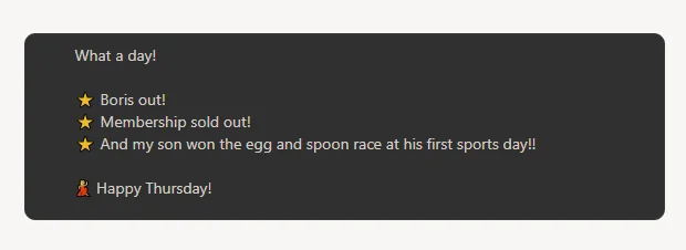
Wisdom Bits
- Visual Appeal: Stars can make your post appear more cheerful and casual, enhancing its relatability.
- Creative Freedom: Utilizing tools like AuthoredUp offers a broader range of visual options than standard text editors, allowing for more creativity in bullet point design.
- Spacing: Proper spacing between bullet points is crucial for maintaining the flow and readability of your post. It prevents the text from looking cluttered and helps convey your message clearly.
Effectiveness of Stars as Bullets
Using star-shaped bullet points effectively ties together various elements of a post, even if they are not all professional in nature.
This type of bullet adds a playful tone to the content, making it more engaging and visually appealing to the audience.
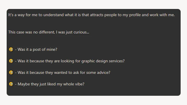
5. Expressing Emotion with Emojis in Your LinkedIn Posts
Adding emojis to your LinkedIn posts can be a powerful way to express your emotions even more.
Emojis allow you to visually represent emotions directly within your content.
They can make your messages more engaging and relatable, as seen in posts where an "inquisitive face" emoji might draw attention to a list of questions.
Wisdom Bits
- Context Sensitivity: While emojis inject personality, it's important to match their use with the tone of your content. For serious topics, it's wise to avoid casual or overly cheerful emojis.
- Supportive Symbols: Hand emojis, like the fist for protest or the "V for peace" sign, can effectively communicate support for causes, with the option to select various skin tones enhancing inclusivity.
- Strategic Use: Emojis can serve as bullet points to break up text and add visual interest, but choose them wisely to avoid detracting from your message or sparking unintended debates.
Effectiveness of Emojis as Bullets
Using emojis strategically enhances the emotional depth and visual appeal of your LinkedIn posts.
They can emphasize key points, convey support, and help your content stand out in a crowded feed. Just remember to use them judiciously, keeping your audience and the formality of the topic in mind.
6. Enhancing LinkedIn Posts with Numbers and Bold Text
When your LinkedIn content demands a more serious tone, such as in announcements or expert articles, traditional formatting elements like numbers and bold text are invaluable.
These classic styles ensure your message is clear and professional without the distraction of more colorful or whimsical bullet points.
Wisdom Bits
- Clarity and Professionalism: Opt for traditional typefaces such as bold, italic, and possibly underlined or strikethrough text to maintain a professional look.
- Organized Content: Use numbered lists to structure your content logically, making it easier for your audience to follow and digest the information.
- Emphasis and Attention: Bold text highlights key points or titles, drawing attention and aiding in information retention.
Effectiveness of Utilizing Number List and Bold Text
Incorporating numbers and bold text in your posts can significantly enhance the organization and impact of your content.
This approach not only provides a clear flow of thought but also emphasizes important information, making it more memorable.
If your list or content is lengthy, integrating italics can further help emphasize specific terms or phrases, adding an additional layer of clarity to your posts.
Quick Breakdown: Pick the Right Bullet Points
The Do's and Don'ts of Adding Bullet Points in LinkedIn Posts
Bullet points are crucial in LinkedIn posts, providing structure and clarity that can significantly influence the tone of your message.
In digital communication, where vocal tone and gestures are absent, these formatting elements play a vital role.
Do’s of Adding Bullet Points in Your LinkedIn Posts
✅ Summarize Concisely: Keep bullet points short and to the point. If they start to become lengthy, consider breaking them down into smaller, more digestible parts.
✅ Ensure Clarity and Accessibility: Write in clear, simple language that can be understood by readers at all levels of expertise, from industry specialists to enthusiastic novices.
✅ Highlight Key Points: Place the most compelling items at the beginning and end of your lists to grab attention and leave a memorable impression.
Don'ts of Adding Bullet Points in Your LinkedIn Posts
❌ Overcomplicate: Avoid using complex or niche vocabulary that might alienate your audience. If you must use specialized terms, provide a brief explanation.
❌ Create Long Paragraphs: Bullet points should not be lengthy paragraphs; they are designed to be brief and straightforward summaries.
❌ Neglect Formatting: Remember that the nuances of different bullet styles can significantly impact the tone and effectiveness of your message. Choose your bullet style wisely to match the communication style and professionalism of your post.
Key Takeaways
Effective formatting is vital for maximizing the impact of your LinkedIn content.
It not only improves readability but also makes your posts more attractive, encouraging deeper engagement from your audience.
Tools like AuthoredUp make it easy to incorporate essential formatting elements like bullet points, which help readers quickly grasp your message.
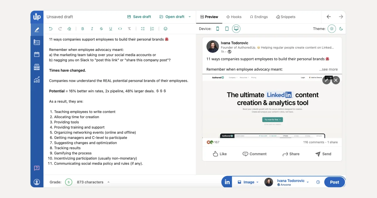
How to Enhance Your LinkedIn Posts with AuthoredUp?
AuthoredUp is a comprehensive LinkedIn content creation tool that not only helps you write and format content but also offers several other features to enhance your posts.
Here’s how you can make the most of it:
👉 Draft and Save Ideas: Easily save your initial thoughts as drafts.
👉 Organize and Track: Keep your posts organized and monitor their performance.
👉 Compare Content: View posts side by side to compare and refine them.
👉 Device Preview: Check how your posts will look on different devices before publishing.
👉 Analyze and Export: Review detailed analytics of your posts and export data as needed.
👉 Monitor Text Metrics: Keep track of various metrics related to your LinkedIn content to optimize performance.
Text Editor Features
AuthoredUp’s Text Editor is equipped with a variety of formatting options to improve the readability and appeal of your posts:
✍️ Basic Formatting: Bold, italic, underline, and strikethrough.
✍️ Lists: Bullet points and numbered lists.
✍️ Emojis: Add emojis to convey emotions and attract attention.
Additional Tools
🌸 Preview Posts: Use the preview option to see how your content will appear when published.
🌸 Templates and Hooks: Access over 150 customizable call-to-action templates and more than 200 engaging hooks.
🌸 Text Snippets: Save frequently used text snippets for quick insertion.
🌸 Visual Forms: Attach images or other visual elements to enhance the attractiveness of your posts.
AuthoredUp can help you simplify the process of creating impactful LinkedIn content and ensure your posts are well-formatted and more likely to engage viewers.
It can be your go-to solution for aligning your content strategy with LinkedIn’s algorithm preferences.

.png)

.png)
.png)
